Origin Finance: Education & Sidekick
Origin is an all-in-one financial planning platform. They seek to make financial advice accessible to everyone, empowering them to take control of their finances regardless of who they are.

The Ask
The acquisition of Finny (a financial education platform) aimed to enhance Origin's financial wellness app for employees, simultaneously driving sustained engagement on the platform. My responsibility was to delineate the user journey, devise a strategy for Finny's integration with Origin, and prepare it for development.
Project Overview
Challenges, background and collaboration
Redesign Challenge
As soon as I was onboarded in the Finny project, Origin kick-off a brand redesign. As simple as it may sound (having a potential risk for the UI phase), the redesign was a big challenge. The current Design System and Components were built using their current system, which needed to be updated. The brand changed for a very serious tone to a more playful one. My wireframes were initially approve in the old system and I helped the DS team translating it to the new system.
Working with Origin's DS
About a week after I joined Origin's team, Figma had a huge update in their system. They introduced the local variables system, which brought to our team a greater power to manage instances more easily. Origin had previously worked with an atomic design approach; and them changed to token-first approach. I was working closely with the Design System team to learn more about how to launch a complex design system, using CSS properties.
Close collaboration with PMs
The collaboration with PMs was key; in my second week with Origin, the Head of Product came to Toronto to have an off-site with me. We came up with a plan for Finny's integration, designed a user flow together and defined a roadmap for the product launch. Because this product would drive the acquisition of leads in the international side of the platform, this was a time-sensitive project. We had to deliver various parts of the journey in a short amount of time, with high quality for our users.
Finny's Educational Journey
Integrating Finny to Origin Platform
To better understand how the user would navigate our experience, during the off-site in Toronto, me and the PM designed the user flow below. We also crafted a sitemap to help us organize the content structure in the integrated experience. The objective of the user flow was to map all the most prominent paths the user might take. We wanted to understand how the features could co-exist and be connected with each other to improve user navigation.

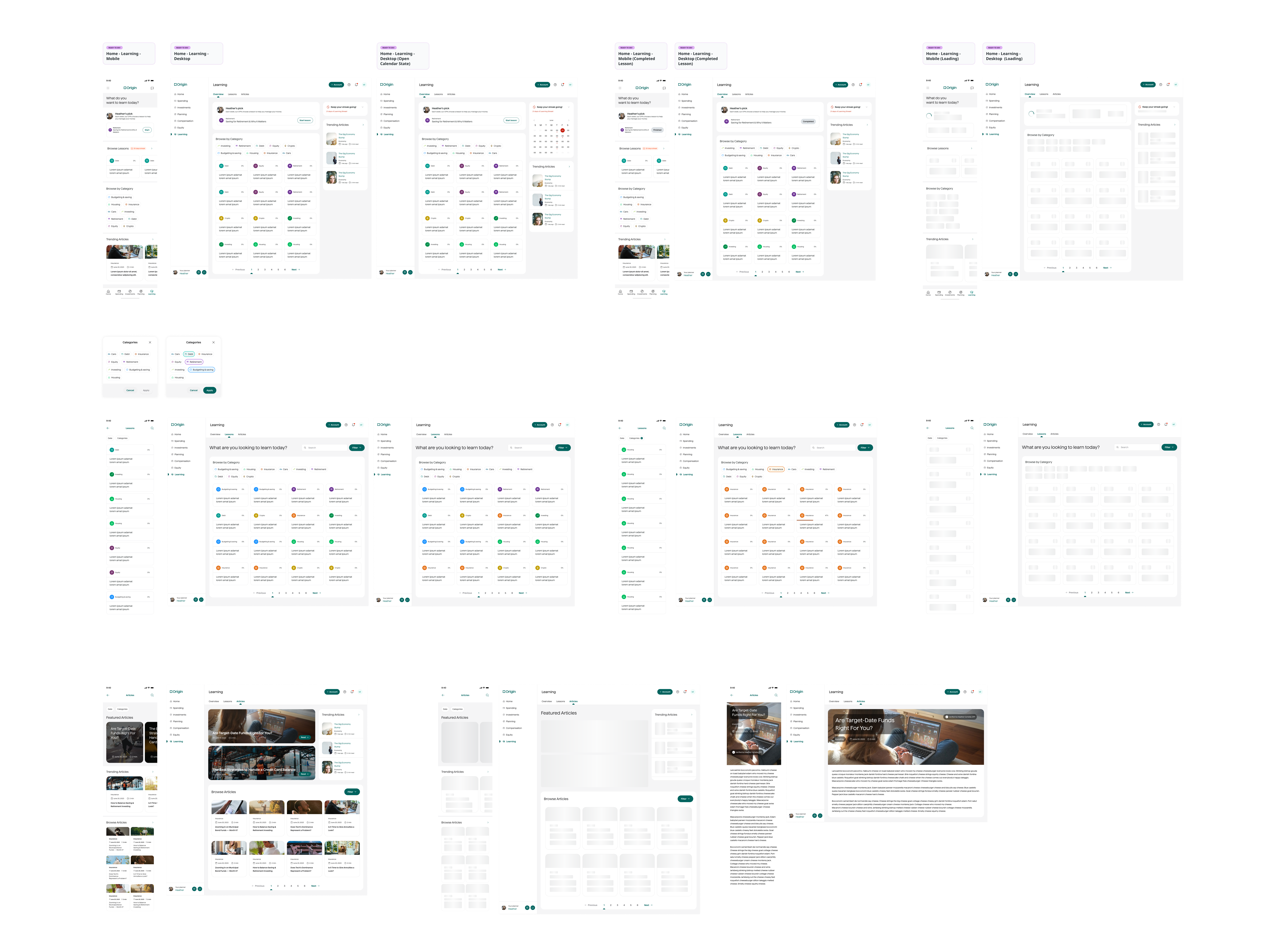
Mainviews for Educational
A design approach to documentation
Origin had several ways to document deliverables. During the rebrand - where Origin switched from being a blue brand to a green brand - we decided to approach the Educational screens with a mainviews approach. It's essentially a static collection of the screens, with no documentation around interactions - interactions would be then documented into a separate file or documented as new screen (eg. Loading screen).
Quiz Flow
Crafting the learning experience
The quiz flow was consider one of the most critical and important parts of the experience. This is where the users would take actual steps into learning new things in the financial world. Content was already validated by the copywriting team, so my goal was to incorporate the content structure (eg. quiz title, main question, question context and answers) to a user friendly interface. Colours were important to stakeholders; as a very unusual request, they wanted me to stay away of the white/clear pattern as much as possible and introduce as many colours the screen could hold. I was able to successfully create a interface with colours, that passed the accessibility without harming the usability.

Remote User Research
Conducting Remote Usability Tests
Setting the Prototype
My primary design responsibility was to create a prototype for user testing. Given its specific use, the prototype didn't allow users much freedom of movement. We chose a guided approach, letting users visually navigate the interface without actual interactions, before directing them to the subsequent step.
Crafting the Script
To brief the user research team I was tasked with creating a script for the user testing. My script should contain a brief intro to the participants, the actual questions (eg. ask before the user clicks on the button "what are you expecting to see in this next screen?"), the prototype path and a space for the facilitators notes.
Conducting the Session
All the sessions were recorded and live streamed to allow stakeholders, PMs and Product Designers to watch. My role was to either facilitate those sessions or take notes for the user research team. I was not involved in screening or booking the participants. We also used Dovertail as our main tool for documentation.
Final Results
The user test was very successful with a few insights from users that led to immediate changes in the product. We decided to create a backlog with user suggestions for the PMs to evaluate as soon as the product was live. Most of the feedback from the test were very aligned with our designs, considering this product a success.
New Ask
After delivering Origin's new educational platform, they decided to extend my contract to embark in a new challenge: design their new chat-based artificial intelligence, Sidekick. As a had a background of designing and using several AI tools, they thought I was the best fit to conduct this short-term project, which was very time sensitive. We had 40 days to design the journey, the screens and ship it for development. Because of the tight timeline, we were not going to facilitate user testings before the handoff (which was considered to be a risk).
Mapping Sidekick's Journey
Understanding the Scope
As a chat-based AI, we didn't want to reinvent the wheel. We knew other products in the finance space had their own models, but ChatGPT was our very best benchmark. We wanted to mainly integrate Origin's new branding to this product. I designed a user flow to map interactions and presented to stakeholders to validate ideas, capabilities and the product vision in the coming years. My idea was to design a product for scale; not just the hype.

Mobile First Approach
Mobile Designs
We knew that this product was mainly going to be access from mobile devices. This was a growing tendency at Origin; whereas in the Education side this wasn't very important, in this project the PMs wanted me to craft a totally new identity for the Sidekick product, disregarding any need to use the same components in Desktop (which was agreed by the engineering team). I made the use of UX best practices, design trends and AI knowledge to craft a clean experience for mobile, that still contained important considerations from stakeholders such as the use of colours.

Desktop Adaptations
A new vision
While transitioning the content from Mobile to Desktop, I collaborated with the engineering team to discern how certain components could be adjusted across different viewports. One key aspect was that the mobile version had a dedicated homepage for sidekick. However, for the Desktop, stakeholders aimed to minimize that extra click and consolidate all features onto one page, akin to ChatGPT's mobile interface. After conducting several user interviews, it became clear that users could easily grasp this layout change, and the dramatic shift in user experience wasn't as significant as anticipated. Consequently, we crafted a few wireframes to outline features, requirements, and technical constraints.

Final Desktop Result
Creating an Experience on Figma
Within a mere two weeks, I crafted a comprehensive desktop framework for Sidekick's desktop version. This effort was a collaborative one, closely involving the engineering and design system teams to ensure our designs were in sync with our scalable system. I also utilized Figma design branches, gaining insights into best practices for design while maintaining file integrity.

What I've learned?
Origin served as my educational ground in design, engineering, and optimal Design System practices. I'm grateful for the opportunity to work closely with the design system team. There, I deepened my understanding of building a sturdy design system, mastering the use of Figma variables, and managing intricate components, including the application of interactive components. My time there felt like a decade's worth of learning in that domain.